Poster Design | Typography
The Silence
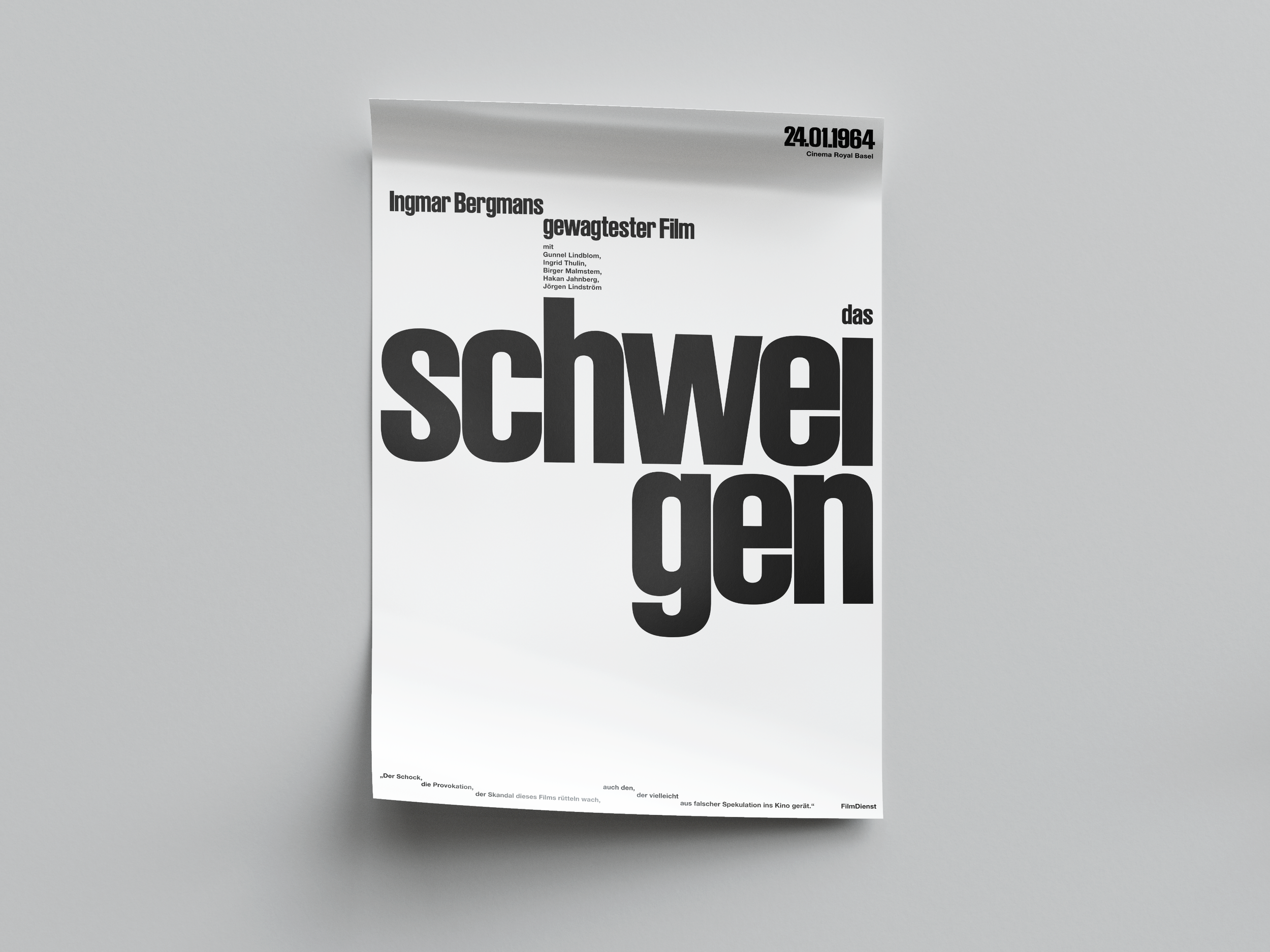
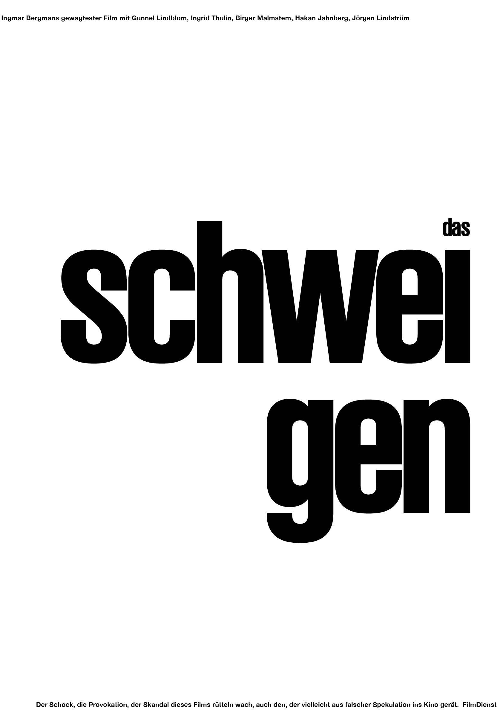
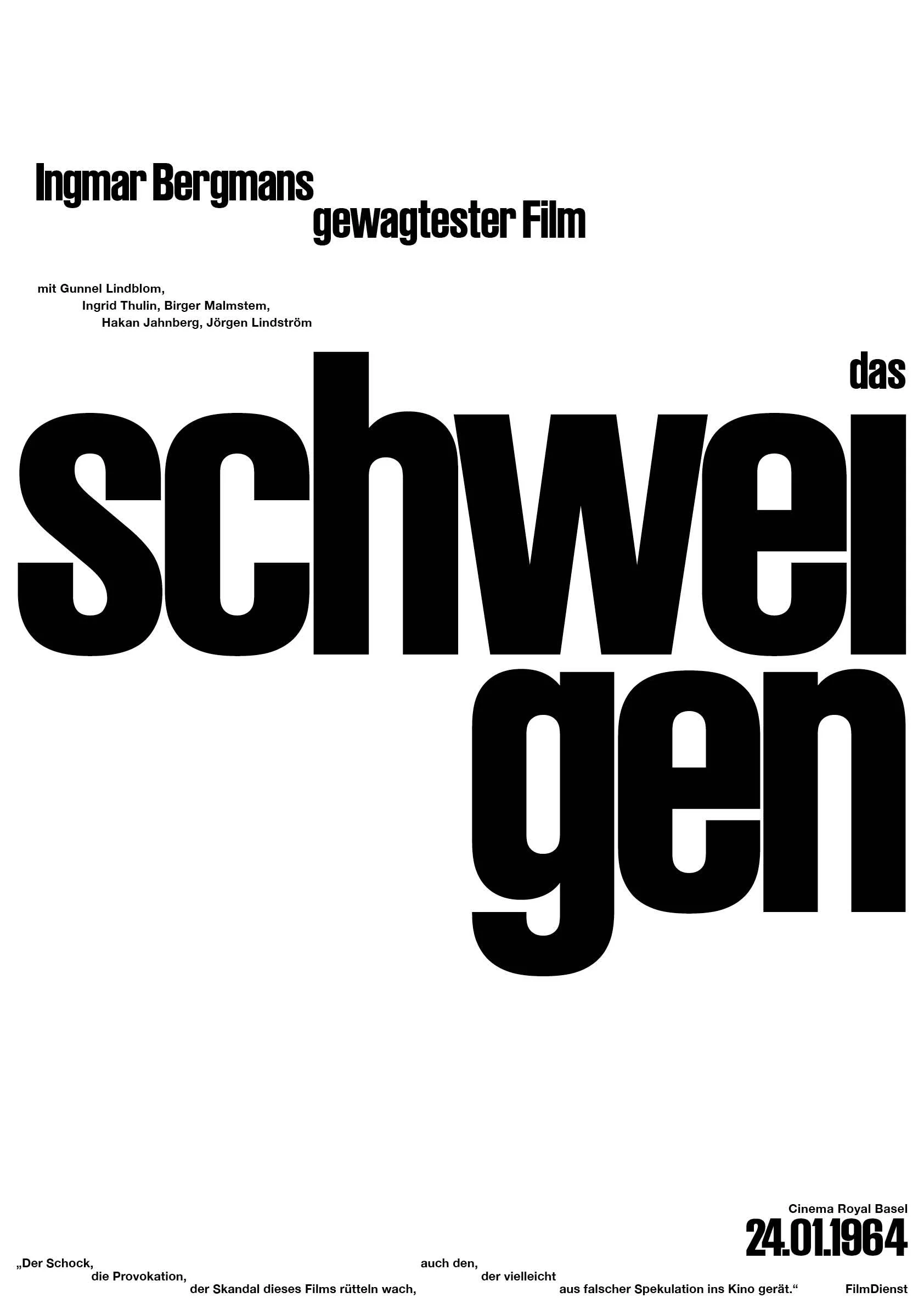
This project was created during the first semester of my studies. For the design of a film poster for "The Silence," the typeface and content were predetermined. Even so, I had access to a nearly boundless field of possibilities. Out of a wide range of ideas, a concrete design gradually emerged — one that follows a grid system and creates a clear, organized overall composition.
[about]
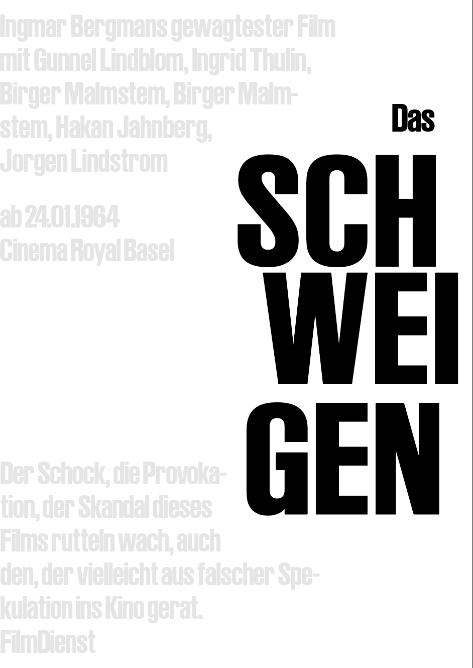
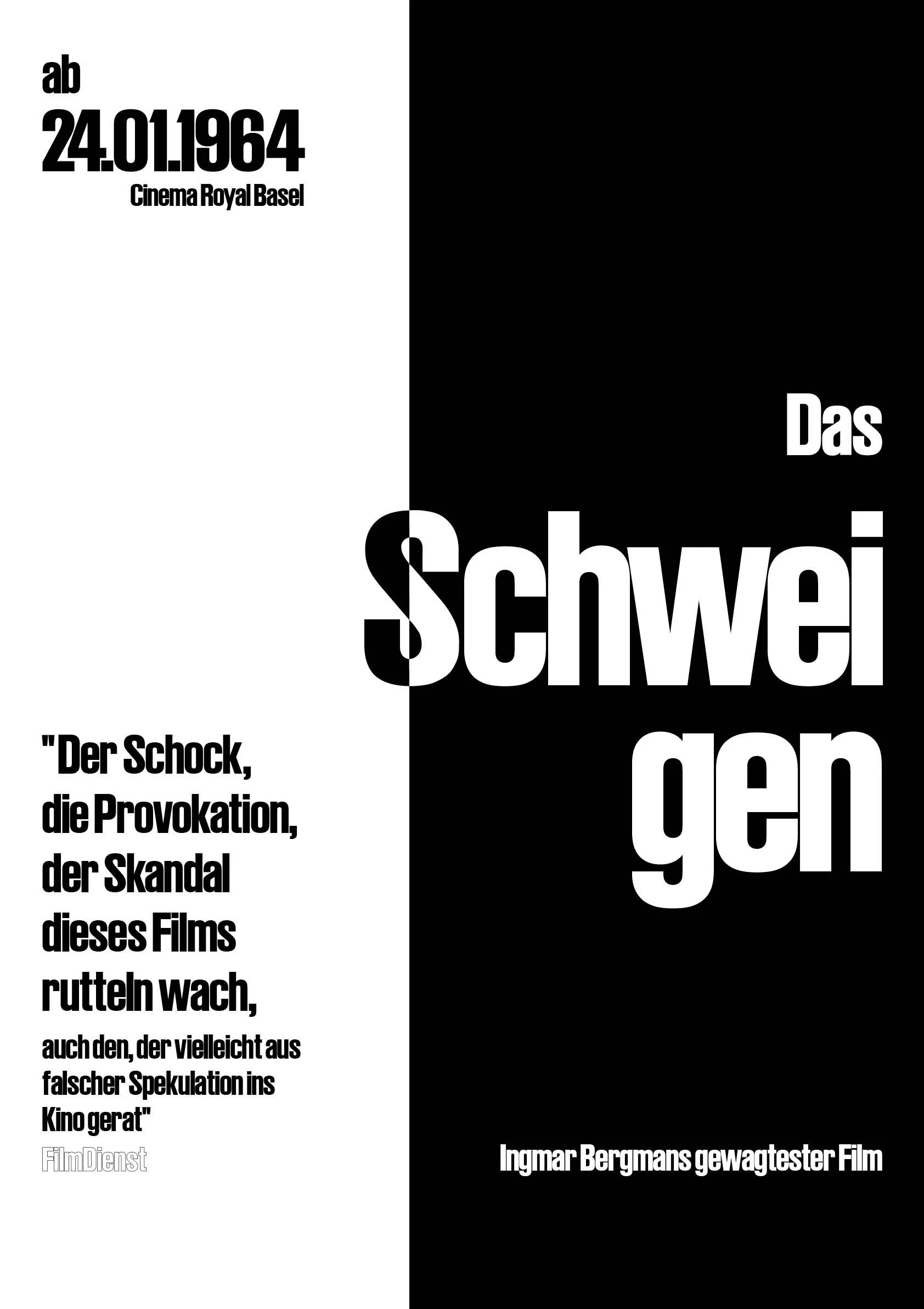
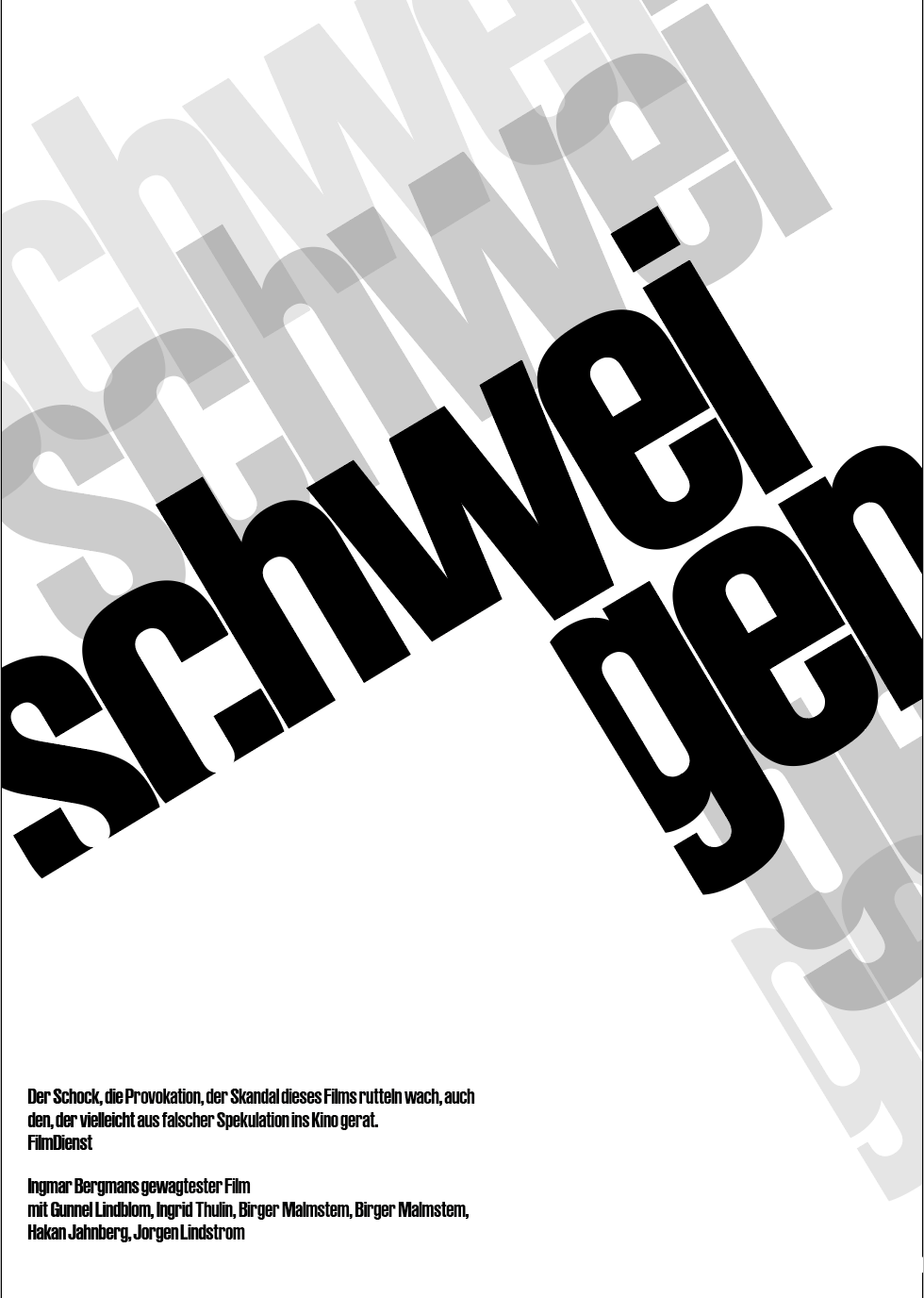
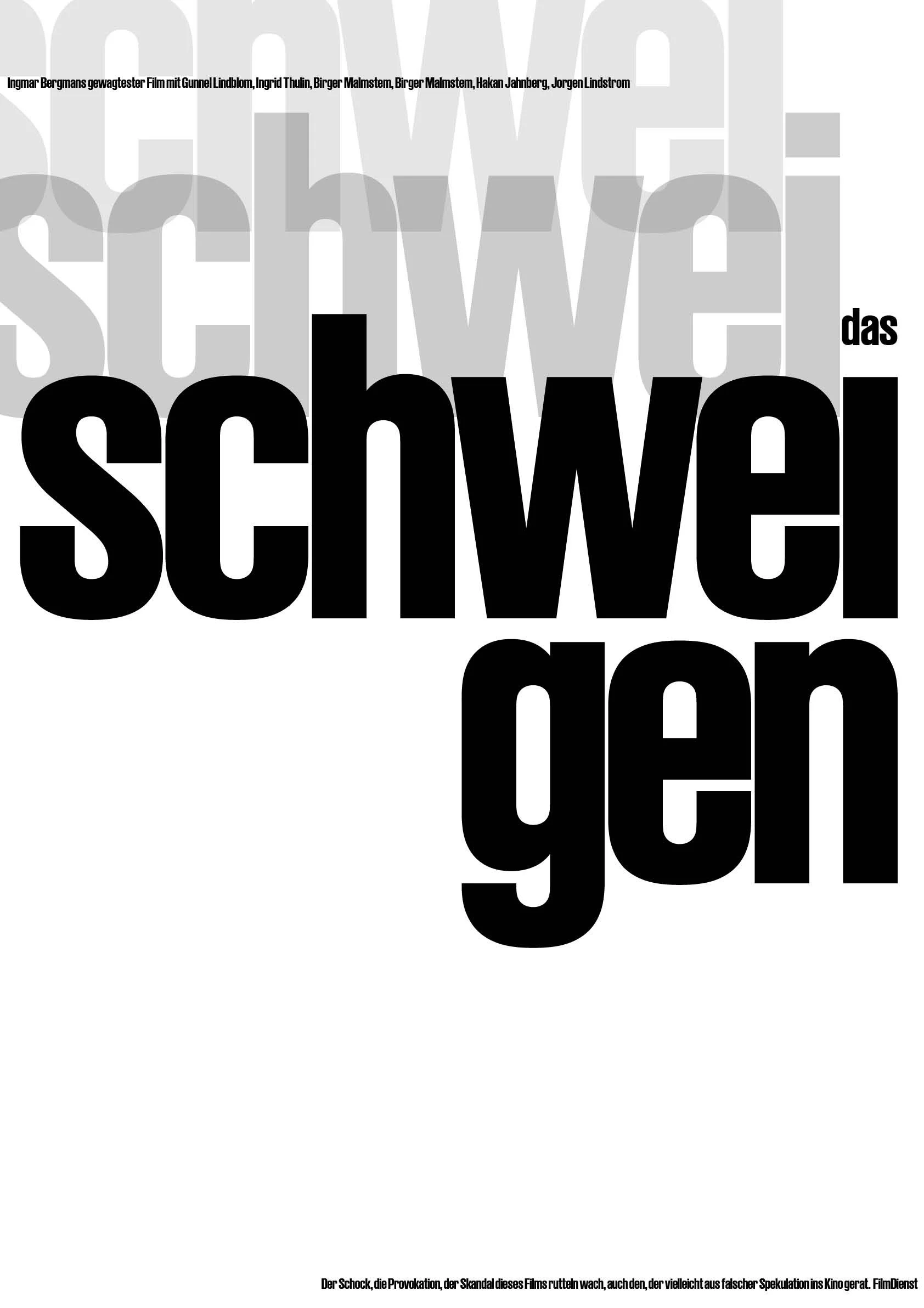
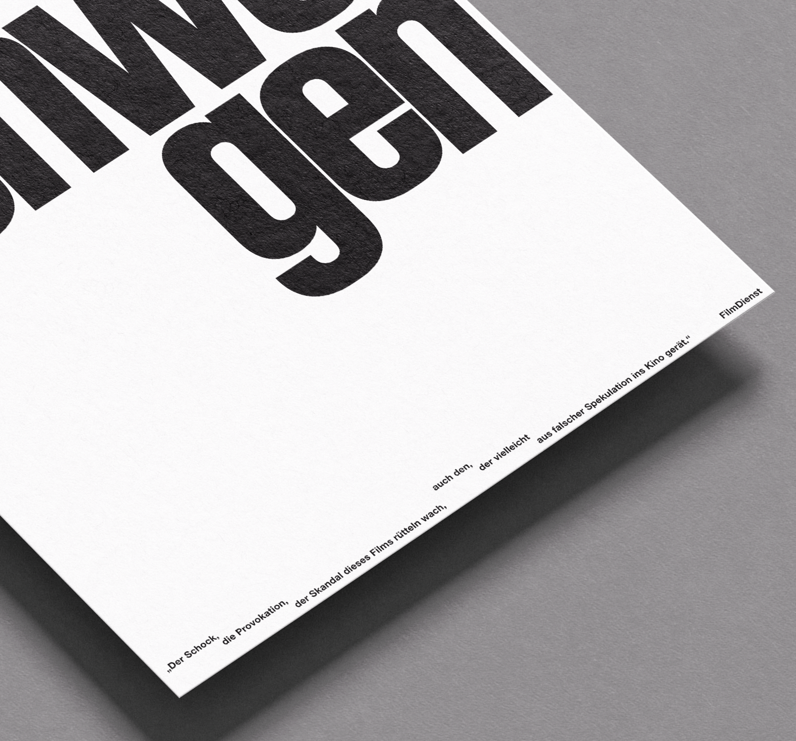
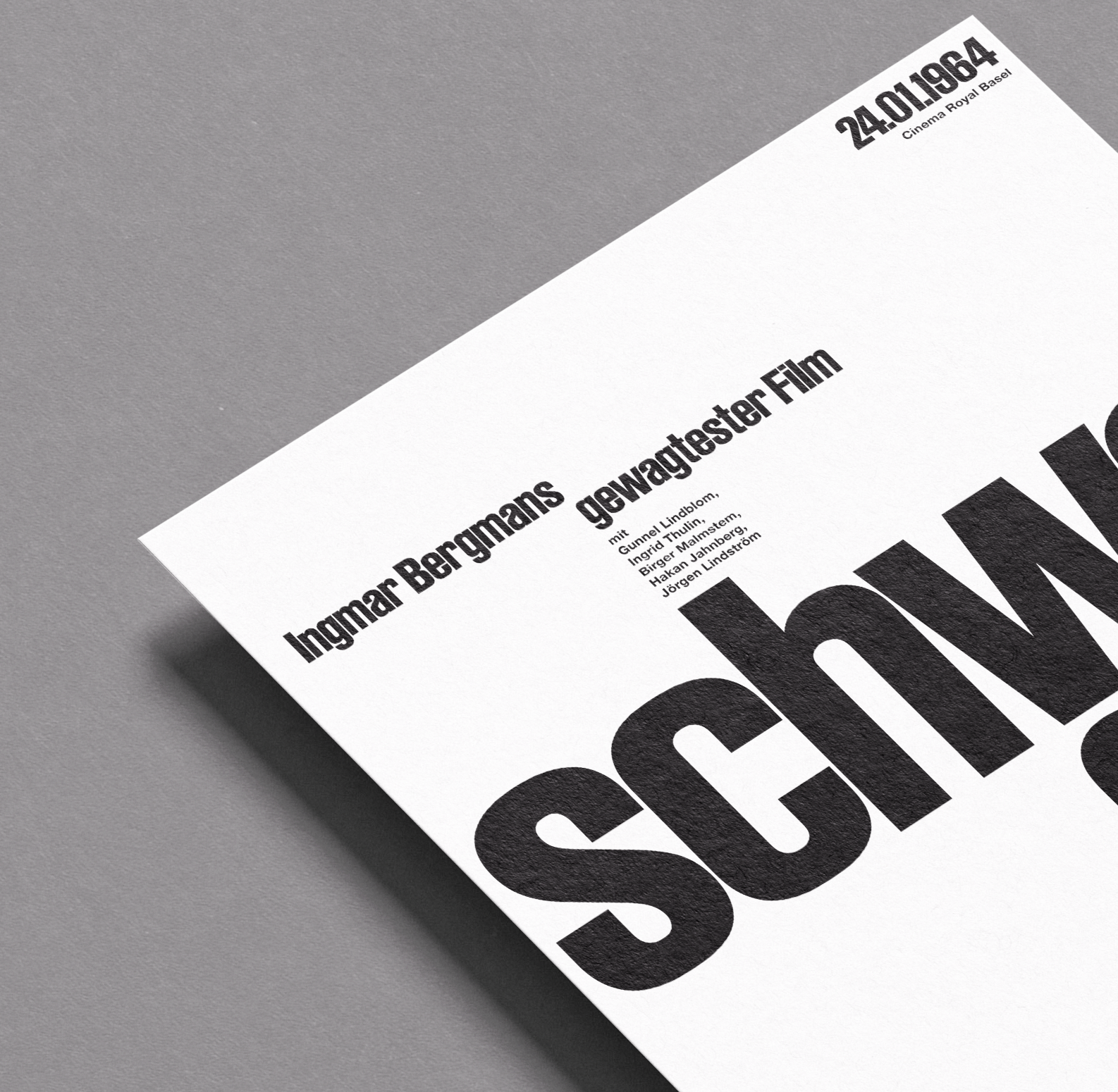
At the core of the result is the word "Schweigen" (silence), broken into syllables on the macro level. This is complemented by a mid-level and a
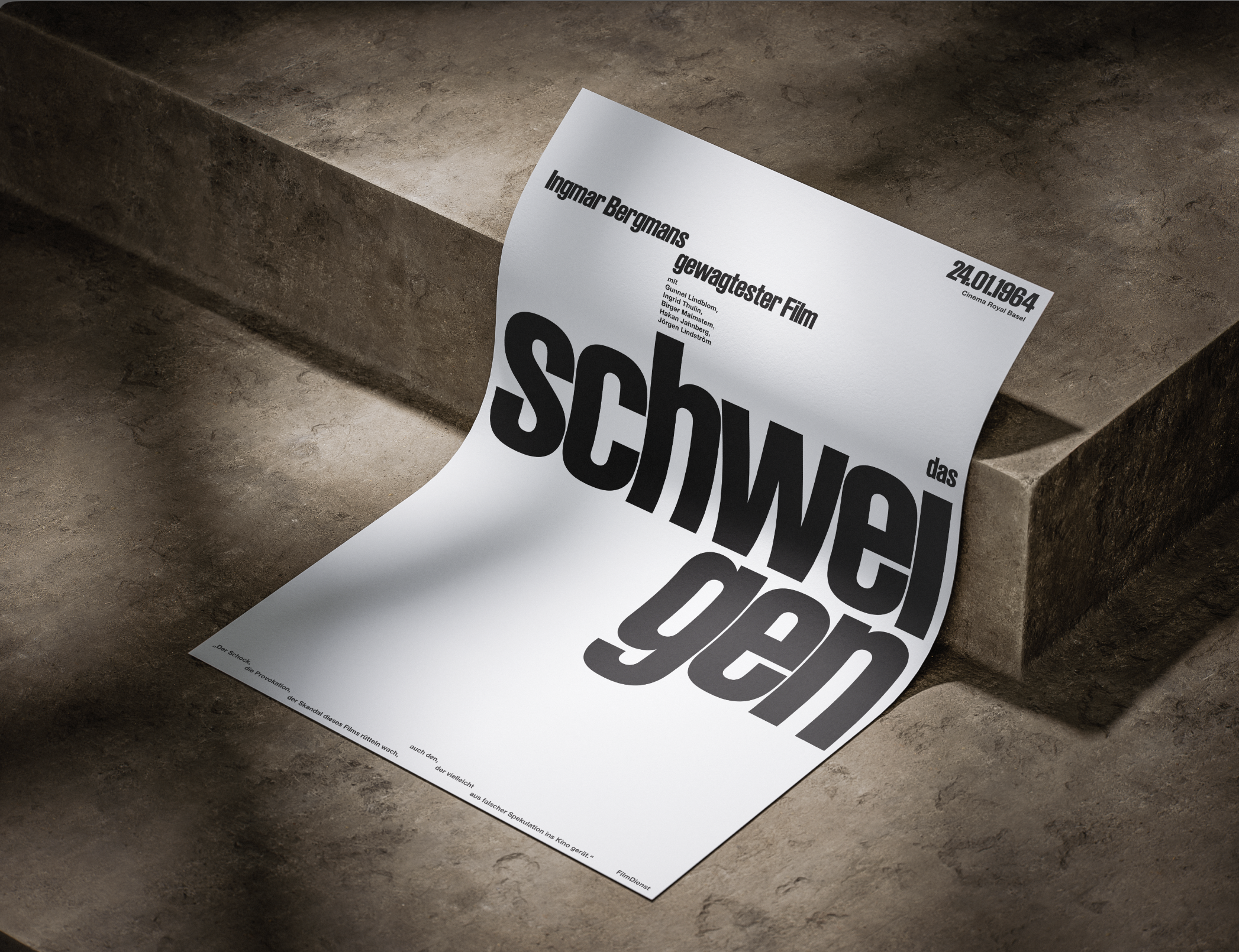
micro-level, in which the characteristic, staggered arrangement of the words repeats. The resulting gaps and negative space symbolize the emptiness and stillness of silence.
[learnings]
Typography | Working with Grid Sytsems | Hierarchy
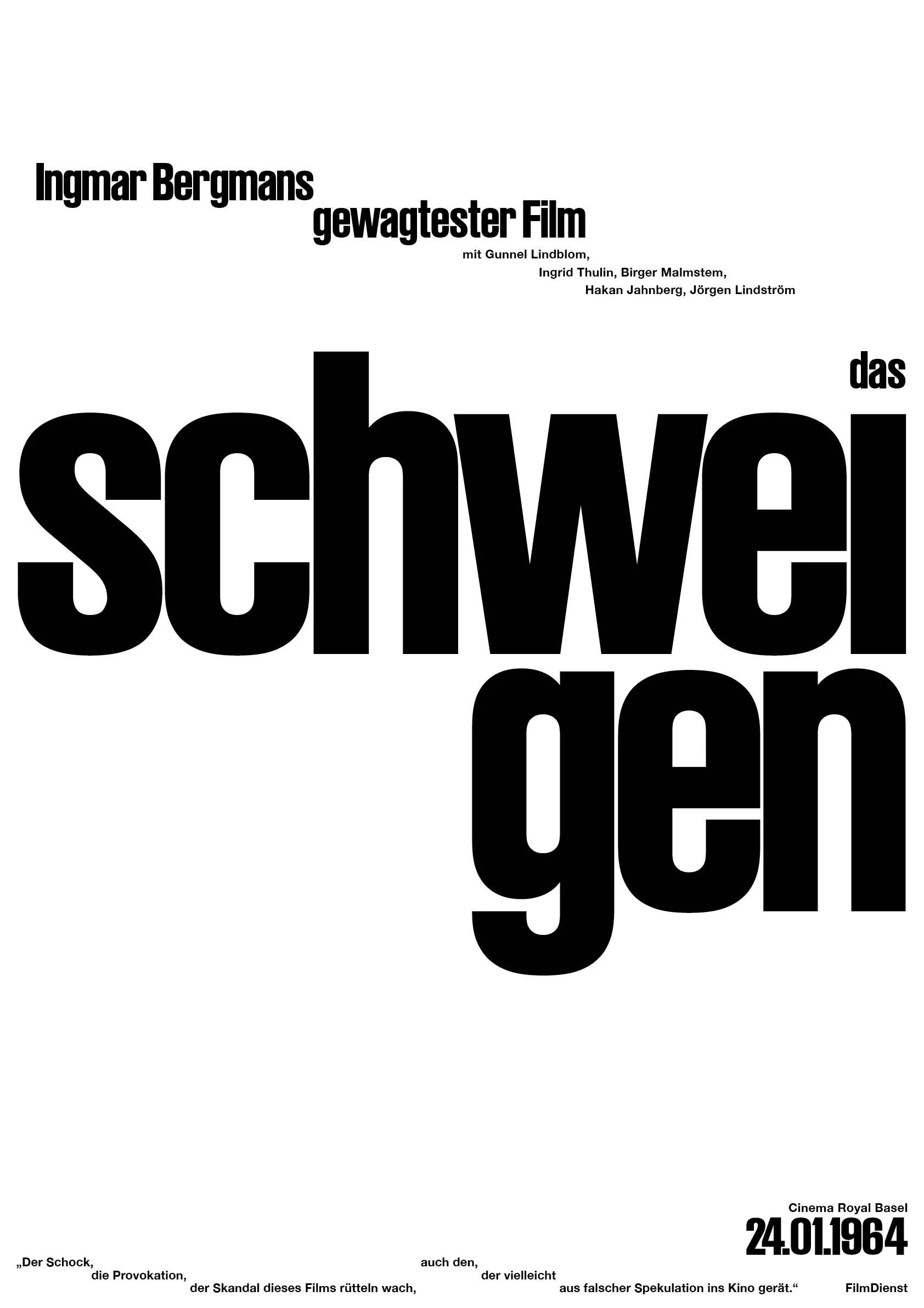
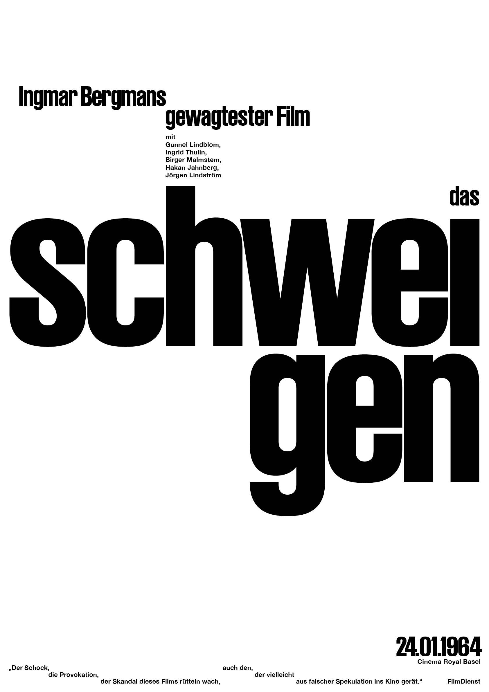
Previous Versions: